2026 Guide
What is Web Design?
BrainStation’s Web Designer career guide is intended to help you take the first steps toward a lucrative career in Web Design. Read on for an overview of web design job responsibilities, where Web Designers come from, and similar jobs in web design.
Become a Web Designer
Speak to a Learning Advisor to learn more about how our courses can help you become a Web Designer.
Thank you!
We will be in touch soon.
What is web design? Web design refers to the practice of planning, conceptualizing, and arranging content intended for the internet. It goes far beyond simply making a web page look pretty. Modern and good web design is about creating a seamless user experience that guides a target audience toward a specific goal. While software engineers focus on the invisible backend code that makes a particular website function, a web designer focuses entirely on the user-facing visual aspects and interactive elements.
Because websites are the primary digital storefronts for most businesses in the world, web design is a highly strategic discipline. It bridges the gap between static graphic design and interactive software. A skilled web designer must balance aesthetics, like a brand’s color scheme, typography, and layout design, with strict technical constraints. This ensures the site loads quickly, ranks well on search engines, and works perfectly on any device’s screen size.
Overview
As you explore this field within the web design industry, you will often see it categorized under the broader umbrella of User Interface design (UI design). While they share a lot of DNA, the practice of web design is specifically tailored to the browser environment. In this comprehensive guide, we will break down the foundational principles of the craft, the tools professionals use to design websites, and what it takes to launch a successful career and build your own website today.
What is Web Design and Development?
To understand the industry, you must understand the line between designing a site and developing it. Web design focuses on the visual architecture and user experience (the “front end” user interface), while website development refers to the actual coding that brings those designs to life and connects them to a server (the “back end”).
To put it simply: designers are the architects, and web developers are the builders.
Design vs. Development: The Breakdown
| Feature | Web Design | Web Development |
|---|---|---|
| Core Focus | Visual aesthetics, user centered design, user psychology, and website’s structure. | Writing clean code, server configuration, and database management. |
| Limitations | Cannot build complex backend logic, secure databases, or process live payments without coding skills. | Does not dictate brand identity, user flows, or visual elements and layout choices. |
| The Handoff | Delivers high-fidelity mockups, interactive prototypes, and organized visual elements (images, icons). | Receives the design blueprint and translates it into functioning HTML (hypertext markup language), CSS, JavaScript, and backend infrastructure. |
It is crucial to understand that web developers do not make Information Architecture (IA) decisions. They do not decide where a menu goes, which buttons link to which pages, or how a user navigates from the homepage to the checkout screen.
The web designer is entirely responsible for organizing all the web content, the linking strategy, and the structural logic. By the time the developer touches the project, they are assuming that the designer has already completed all the user research and strategic planning required to make a user friendly website successful.
What Designers Need to Know About Development (Without Being a Developer)
You do not need to be a full-time programmer with deep programming languages expertise to be a successful designer. However, the best designers understand the developer’s toolkit so they can create realistic designs that are actually possible to build. Here is what you need to know:
The Basics of CSS
Knowing what is CSS in web design is mandatory. CSS (cascading style sheets) is the coding language that dictates how structural HTML elements are styled. While you may not write it from scratch, understanding how CSS controls grid layouts, a color scheme, and column widths ensures you don’t design layouts that are a nightmare for developers to code.
Technical SEO
A strategic designer must know what is SEO in web design. Search Engine Optimization isn’t just about keywords for copywriters, it relies heavily on technical SEO. Search engines like Google rank websites based on Core Web Vitals, metrics that measure how fast a web page loads and how smoothly it handles user interaction. Designers directly control this through mobile optimization and designing mobile friendly websites, optimizing image file sizes, and avoiding heavy, bloated animated graphics that slow down the site.
URL and Site Mapping
Knowing what a slug means in web design is essential for designers establishing the website’s structure. A slug is the specific, readable part of a URL that identifies a page, like /brainstation-career-guide. It allows designers to plan organized site hierarchies before the code is written.
What are the Key Principles of Good Web Design?
Creating a visually appealing and effective website goes beyond just having a good eye for visuals. Good web design relies on a blend of psychology, usability, and aesthetic principles that work together to create a welcoming and user friendly experience. Whether you are designing a streaming or an e-commerce platform, keeping these key elements in mind will help your work truly stand out and connect with users.
- 1
Typography
Typography is the art and technique of arranging written content. It encompasses font selection, point size, line length, line-spacing (leading), and letter-spacing (kerning) to make written language highly legible and visually appealing.
Web Design is 95% typography.
Why is typography important in web design?
Because if users can’t read your content effortlessly, they won’t stay on your site. Effective typography captures attention and makes reading a frictionless experience, keeping visitors engaged with your message longer and driving them toward your conversion goals.
- 2
Visual Hierarchy
Visual hierarchy is the structural arrangement of design elements in a way that implies importance. It creates a clear visual path that the human eye naturally follows when scanning a digital page.
How to use visual hierarchy in web design?
Using visual hierarchy allows you to guide the user’s eye exactly where you want it to go. By manipulating size, a vibrant color scheme, and contrast, designers ensure that the most important element (like a primary “Buy Now” button) is seen first, seamlessly leading the user down to secondary supporting information.
- 3
Accessibility
Digital accessibility is the inclusive practice of ensuring there are no barriers that prevent interaction with, or access to, websites by people with physical, situational, or socio-economic restrictions.
What is accessibility in web design?
It is the practice that ensures your site can be navigated by everyone, including users with visual, auditory, or motor disabilities. This involves strict adherence to WCAG (Web Content Accessibility Guidelines), which dictate rules for proper color contrast, keyboard accessibility (keyboard-only navigation), and screen-reader compatibility.
- 4
Brand
In a general marketing context, a brand is the distinct identity a business creates in the mind of consumers. It encompasses a company’s mission, values, voice, and visual elements (like logos and colors) to differentiate it from competitors.
What is branding in web design?
It is the practice of translating a company’s overarching identity into a digital space. A user should instantly recognize a company’s color scheme, logo usage, and visual style the second a web page loads. Consistent branding across a website builds immediate trust and reinforces brand recall.
- 5
Spatial Grouping
Spatial grouping is the strategic use of whitespace (or negative space) to organize UI elements into logical clusters. It helps the human brain categorize information on a screen without needing explicit borders or dividing lines.
What is the law of proximity in web design?
This is a psychological principle that is crucial for reducing visual clutter. It states that elements placed close together are automatically perceived as related. By tightly grouping a product image, its title, and its price, and adding ample space around that group, designers help users digest complex information blocks quickly.
- 6
Modern Aesthetics
Modern aesthetics refer to the current web design trends, visual languages, and stylistic directions that make a digital interface feel contemporary, fresh, and technologically up-to-date.
What is parallax effect in web design?
The parallax effect is a visual scrolling technique where the background images of a website move at a slower pace than the foreground content. This creates an engaging, three-dimensional illusion of depth that makes the browsing experience feel more dynamic and interactive.
What is glassmorphism in web design?
Glassmorphism is a popular modern UI trend that uses background blur, subtle borders, and transparency to create a “frosted glass” effect. This technique allows designers to create deeply layered interfaces that establish depth and separate foreground content from the background, giving the site a sleek, futuristic feel.
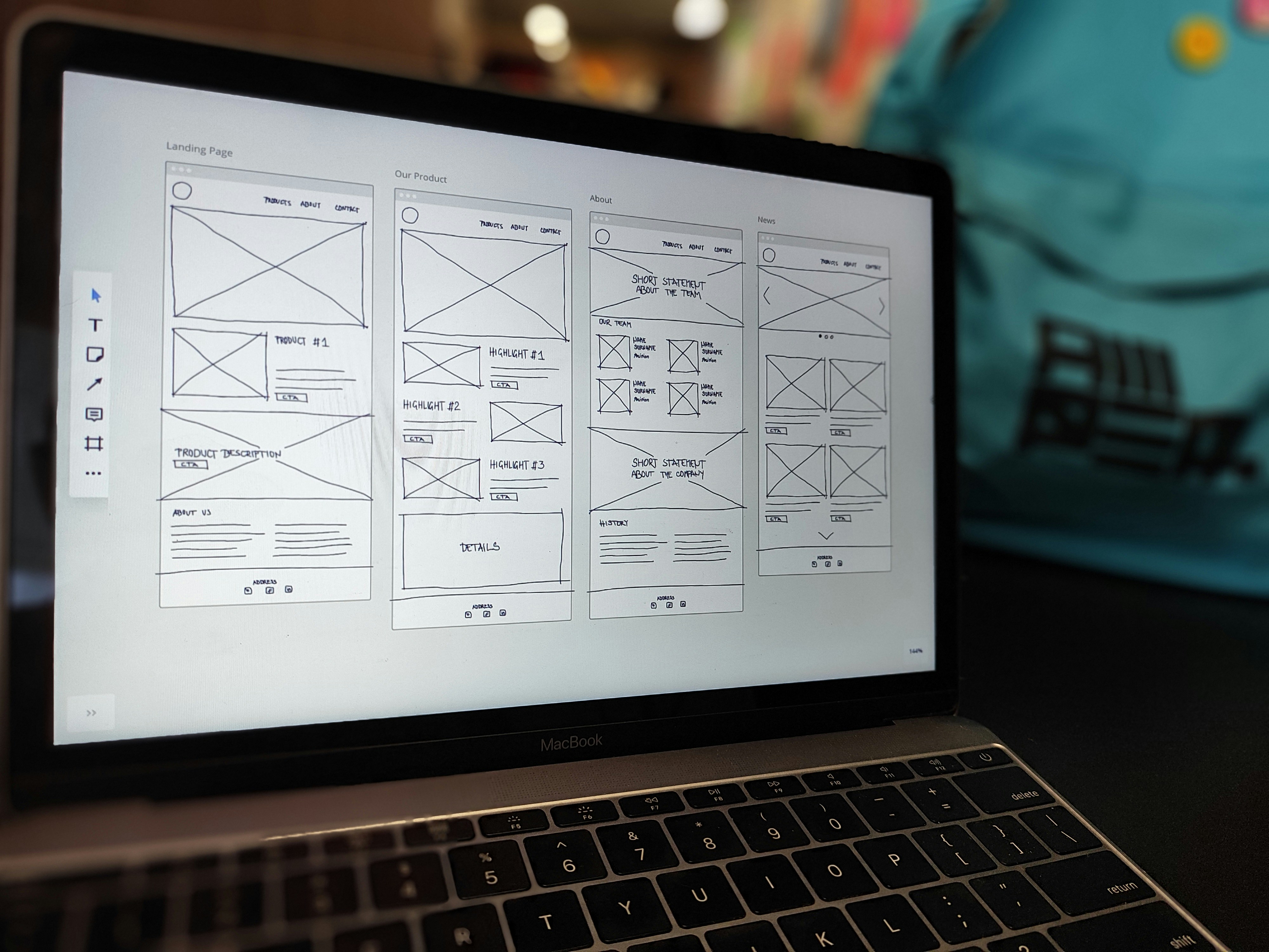
What is Information Architecture in Web Design?
Before a single color is chosen or a pixel is pushed, a web designer must organize the site’s content. Information Architecture (IA) is the structural blueprint of a website. It ensures that content is categorized logically so users can find exactly what they are looking for without frustration. By establishing a clear hierarchy early on during the web design process, designers create a solid foundation for the rest of the visual and technical build.
Sitemap
A sitemap is a hierarchical list or diagram that outlines the pages, videos, and other files on a site, as well as the relationships between them. It serves as a planning tool for digital teams and a roadmap for search engines.
What is a sitemap in web design?
It acts as the foundational skeleton for the project. By mapping out exactly how every page on a website connects to the others, a designer ensures that no page is left orphaned and that the overall user journey from the homepage down to the deepest sub-page makes logical sense.
Navigation Elements (Breadcrumbs)
Breadcrumbs are a secondary navigation system that displays a user’s current location within a website’s hierarchy, typically presented as a horizontal text trail separated by symbols (like ” > ” or ” / “).
What are breadcrumbs in web design?
These are specific visual cues that allow designers to implement secondary navigation trails (e.g., Home > Men’s Clothing > Shoes > Sneakers) at the top of a page. Incorporating breadcrumbs ensures users never get lost deep within a complex site, allowing them to jump back to higher-level categories with a single click rather than relying on the browser’s “Back” button.
Responsive vs Adaptive Web Design
In the early days of the internet, websites were built for a single desktop monitor size. Today, that approach guarantees a frustrating user experience. Understanding how multiple screen sizes affect web design is the foundation of modern website layout. Because users access the web on thousands of different screen sizes, from massive 4K monitors to tiny smartphones, designers must rigorously control spacing and structure to ensure usability is never compromised across mobile devices.
To solve the challenge of multiple screen sizes, designers rely on two primary layout strategies: Responsive Web Design and Adaptive Web Design.
| Feature | What is Responsive Web Design? | What is Adaptive Web Design? |
|---|---|---|
| The Definition | It is the practice of building a single, fluid layout that automatically shrinks, stretches, and rearranges itself to fit the device viewing it. Responsive design uses flexible grids and CSS to ensure a desktop layout elegantly stacks into a single column on mobile. | It is a fixed approach that utilizes multiple, distinct, pre-built layouts for specific screen sizes. When a user visits the site, the server detects the device and delivers the specific static layout built for that exact screen. |
| Layout Style | Fluid and flexible. The design constantly shifts to fit the exact width of the browser window. | Fixed and rigid. The design snaps into place based on predetermined screen breakpoints. |
| Development Approach | Requires coding one single, comprehensive layout that uses percentages for sizing. | Requires building and maintaining multiple separate layouts for different devices. |
| Loading Speed | Can sometimes be slower, as the browser must download the entire fluid code package regardless of device. | Often faster, as the server only sends the specific, optimized assets meant for that exact device. |
| Best Use Case | Modern websites, blogs, and e-commerce platforms that need to look perfect on every possible device’s screen size. | Retrofitting older, complex websites to work on mobile without completely rebuilding the desktop version. |
What is padding in web design?
Padding is the internal space between an element’s content and its border. On a desktop, a button might have standard padding, but on smaller mobile resolutions, designers must increase that padding to ensure the button becomes a larger, easily clickable “touch target” for human thumbs.
What Tools are Used for Web Design?
The modern web designer’s toolkit has evolved far beyond basic coding editors. Today, designers rely on a “stack” of design software to handle everything from initial wireframing to final launch. While the exact stack varies by agency, a professional web designer will generally use a combination of the following:
- Figma: The undisputed industry standard for user interface design and interactive prototyping. It allows multiple designers and web developers to collaborate on a layout in real-time within the browser to map out user flows and create wireframes.
- Webflow: A powerful visual website development platform. It allows designers to create websites visually while the platform automatically writes clean HTML (hypertext markup language), CSS, and JavaScript in the background.
- WordPress: The world’s most popular Content Management System (CMS) and website builder. It is heavily used for content-heavy sites and blogs, relying on themes, customizable templates, and plugins to combine design with robust backend functionality.
- Adobe Creative Cloud (Photoshop & Illustrator): The mandatory suite for creating, editing, and optimizing the static visual elements, like custom vector icons, complex illustrations, and compressed photography, that populate the website.
What AI Web Design Tool Should I Consider?
Artificial intelligence is quickly becoming a standard part of the creative toolkit, serving as a helpful “co-pilot” for designers. Rather than shifting the industry away from human creativity, these tools are helping designers streamline their web design process and spend more time on the strategic aspects of a project. If you are looking to enhance your design stack and increase your daily productivity to design websites, here are the AI-powered tools leading the way:
- Relume: An AI partner for the structural phase. It instantly generates sitemaps and wireframes from a simple prompt, which you can export directly into Figma or Webflow.
- Framer AI: Ideal for rapid ideation. It generates baseline responsive design layouts from text, helping you move past “blank page syndrome” and straight into the refinement stage to design websites.
- Adobe Firefly & Midjourney: Your go-to for bespoke asset creation. Use these to generate custom placeholder images, textures, and backgrounds tailored to your specific brand identity.
- Claude / ChatGPT: The modern replacement for “Lorem Ipsum”. These models generate realistic copy so you can design layouts around actual content lengths rather than generic filler.
What are the Main Features of AI Web Design?
There is another side to AI in web design: building AI into the website for the end-user. As businesses integrate AI APIs into their platforms, web designers must learn how to design the interfaces for these intelligent features. If you are designing a modern, AI-integrated website, you must be prepared to design for:
Dynamic Personalization Blocks
AI can analyze user behavior in real-time. Designers must build “modular” layouts where the AI can automatically swap out the hero image, rewrite the headline, or change the featured products based on the specific preferences of the person viewing the responsive sites.
Conversational UIs (Advanced Chatbots)
Designing the user interface for an LLM-powered assistant requires more than just a standard text box. Designers must create intuitive chat windows that gracefully handle text, display suggested prompts, and format complex AI responses (like tables or bulleted lists) so they are easy to read and user friendly.
Generative Search Interfaces
Standard search bars are being replaced by “Prompt” inputs. Designers must create interfaces that encourage users to ask complex, natural-language questions, and design the site’s layout for the synthesized, AI-generated answers that appear beneath them.
Is Web Design a Good Career?
Yes, web design is an exceptionally rewarding career, particularly for those looking to make a strategic career switch into tech. When evaluating if a career is “good”, prospective students or career switchers usually look at three things: ROI on education, day-to-day working conditions, and long-term growth. Web design delivers on all fronts.
As businesses rely increasingly on their digital storefronts to drive revenue, the web designer has moved from a “luxury” creative hire to a core business necessity. Because of this high demand, entry-level salaries offer a comfortable starting point, and the financial ceiling for senior roles is high.
Web design also offers some of the highest flexibility in the tech industry. It is a role inherently suited for remote work, giving professionals the freedom to choose between the stability of an in-house corporate role, the fast-paced variety of an agency, or the complete independence of freelancing to create websites for their own clients.
Is Web Design in Demand?
Yes, but the nature of the demand is evolving. The entry-level market is competitive. Because modern tools have lowered the barrier to entry, there is a saturation of beginners.
However, the demand for highly skilled, strategic web designers, those who possess deep web design knowledge, understand UI principles, conversion rate optimization, and accessible design, is surging. Companies are desperately seeking mid-level and senior designers who can bridge the gap between business goals and digital execution.
Perhaps the best part of the demand is the career mobility. The web design skills you learn are highly transferable, allowing you to easily pivot your career in multiple directions as you grow:
Is Web Design Hard?
The honest answer is that the basics of web design are highly accessible, but true mastery requires dedication and practice.
Because the industry heavily favors a strong portfolio over a traditional pedigree, a four-year university degree is just one option. The foundational technical skills can be learned much faster through self-guided practice or accelerated skill-focused certification programs.
However, professional web design does require a commitment to lifelong learning. To stay relevant in the industry, you must be prepared to continuously adapt as visual trends, user expectations, and design software constantly evolve.
Fortunately, the technical barriers to entry are lower than many expect. Advanced math is not required, and while knowing the basics of programming languages like HTML and CSS is an advantage, it is usually not a strict requirement to start your career.
How to Learn Web Design?
To build your foundation, your choice of education depends entirely on your timeline, budget, and learning style:
- Traditional University (4 Years): Excellent for deep dives into theory and networking, but requires a massive time and financial commitment.
- Certificates (8 to 24 Weeks): The best option for career switchers. These intensive programs cut out the fluff, focusing strictly on the modern tools and portfolio pieces hiring managers actually want.
- Self-Taught (Variable): Offers ultimate flexibility and zero debt. However, it requires immense discipline and lacks crucial professional mentorship.
Which Web Design Course is Best?
If you are piecing together your own curriculum rather than taking a full program, the order of your courses is critical. To build a hireable skill set, target these three classes in this exact sequence:
- 1st
PhaseVisual Design Fundamentals
Learn the core aesthetic rules of typography, color theory, and visual layout composition.
Why take this first?
It ensures you understand the universal laws of good design before you ever touch specialized software or code.
- 2nd
PhaseUser Experience (UX design) and Information Architecture
Shift your focus from aesthetics to human psychology to ensure a user friendly experience. You will learn wireframing, accessibility standards, and intuitive navigation.
Why take this second?
It trains you to design for the user’s actual needs, ensuring your layouts are logical and optimized for conversion.
- 3rd
PhaseHands-On Web Design & Prototyping
Take a project-based class where you use tools like Figma, Webflow, or basic HTML/CSS to actually build out the layouts you’ve designed.
Why take this last?
A hands-on class forces you to combine your visual and UX design skills to build a complete, functional website, leaving you with the polished case study you need to start your portfolio and actually apply for jobs.
How to Create a Web Design Portfolio?
Your portfolio is the ultimate proof of your competence and web design knowledge. Because modern web design is so deeply rooted in usability and logic, a standout web design portfolio shares almost all of its structural DNA with a high-end UX portfolio.
Hiring managers do not just want to see a gallery of static, pretty websites. They want to see your critical thinking and your design process. To get hired, you should feature comprehensive case studies that highlight:
- Responsive Websites: Clear visual examples of how your responsive design adapts from a widescreen desktop monitor to a mobile screen.
- Visual Command: Your strategic use of design elements, typography, a cohesive color scheme, and spatial grouping to guide the user’s eye.
- Problem-Solving: A clear explanation of the business problem you were given, the technical constraints you faced, and how your final responsive web design solved the issue to provide a seamless user experience.
FAQ
get started
Accelerate Your Design Career
Courses built on adaptive curriculum and led by leading industry experts.
Work on projects in a collaborative setting
Get access to VIP events and workshops
Taught by industry experts