2026 Guide
UI Design Tools and Skills You Need to Master
BrainStation’s UI Designer career guide is intended to help you take the first steps toward a lucrative career in UI design. Read on for an overview of the top skills needed for a career in user interface design.
Become a UI Designer
Speak to a Learning Advisor to learn more about how our courses can help you become a UI Designer.
Thank you!
We will be in touch soon.
Entering UI design can feel overwhelming with rapidly evolving trends and constant software updates. However, your true value as a designer will always rely on your ability to create and execute. Reading about color theory and UI basics is a great start, but translating those concepts into functional, interfaces for a website or app is what actually lands you the job. To succeed, you must build a strong technical foundation that bridges the gap between aesthetics and a developer’s code, requiring a deep understanding of modern styles, responsive layouts, and constraints.
This guide breaks down the exact technical skill set you need to master. We will explore the industry-standard tools that accelerate your workflow, and the foundational design patterns required to solve real user problems in your design process. Whether you are building mobile apps, a complex website dashboard, or emerging AI interfaces, mastering these UI design tools is your blueprint for a successful career in the field.
UI Designer Skills
To land a role in the modern tech landscape, a UI designer must possess a specific blend of technical execution and platform knowledge. Hiring managers and recruiters look for these competencies on your resume and portfolio:
Advanced Design Tooling
Expert-level proficiency in an industry-standard design tool (specifically Figma), including mastery of scalable components, auto layout, responsive constraints, and design tokens to build fully functional prototypes.
Visual & Typographic Hierarchy
A proven understanding of layout principles, scale, whitespace, mathematical grid systems (such as the 8pt grid), and accessible color theory (WCAG compliance) to produce high-quality graphics.
Cross-Platform Adaptability
Experience designing fluid, responsive interfaces that translate seamlessly across desktop browsers, iOS, and Android platforms, ensuring every user interface looks great.
Design System Governance
The ability to build, maintain, and scale centralized kits and libraries (including a brand kit) to ensure visual consistency across large-scale digital products, which helps in reducing friction for the whole team.
Technical & Developer Collaboration
A strong understanding of front-end development constraints (HTML/CSS layout logic) to facilitate smooth design-to-code handoffs for any website or application, even without deep coding knowledge.
Conversational & Agentic Design
While an emerging specialization, mastering AI-driven user flows is rapidly becoming a competitive advantage. This involves applying foundational UI/UX principles to unpredictable systems, designing intelligent chatbot logic, predictive states, and dynamic feedback loops that guide users through automated workflows.
Essential UI Design Software & Toolkits
To build professional interfaces, you need to equip yourself with the right digital workspace. In the modern tech stack, this boils down to two main categories: software and toolkits.
Your design tool is the primary application or canvas where you draw, layout, and prototype your screens. Toolkits, on the other hand, are the pre-built libraries of buttons, icons, and typography styles that you plug into your tool to speed up your process. Understanding the leading options in both categories is the first step toward building a highly efficient design process when you create a website.
Leading Prototyping Software for UI Design
While the tool landscape is highly competitive, aspiring designers only need to focus on current industry standards. When evaluating your options, consider the tool cost and whether it provides an adequate free plan.
The top UI design tools dominating the market include:
Figma
A cloud-based, collaborative platform used by most tech companies for its seamless collaboration. Because Figma is browser-based and can operate without installation, it allows cross-functional teams to jump straight into a project from any device. Mastering its advanced ecosystem, specifically Auto Layout, Variables, and Dev Mode, is essential to get hired. Additionally, Figma offers a powerful component library for designers, allowing product teams to scale global styles easily. However, keep in mind that Figma’s complex features are rarely needed by most clients, and Figma’s pricing can be expensive for small businesses. Still, it remains a dominant tool that allows you to export designs easily and handle large files well, providing an ecosystem that will quickly feel familiar to transitioning Adobe XD users.
Penpot
A free alternative gaining traction with developer-led teams due to its use of native web standards (CSS Flexbox and Grid), and its self hosting options, making handoffs seamless. Penpot is free to start with various plans for teams.
Uizard
This platform is used for rapid ideation that converts text prompts or sketches into editable, multi-screen prototypes for brainstorming.
Framer
An alternative route when you need a website fast. It functions as both a design tool and a builder where you can publish directly to custom domains.
UI Kit Design
A UI kit is a comprehensive, pre-designed library of components (buttons, navigation bars, typography scales) packaged in a single file, supporting various file types. Professional designers rarely build from scratch, they leverage kits for three reasons:
- Speed: Drag-and-drop mechanics eliminate the need to design pixels manually, leaving you more time for user testing.
- Consistency: Ensures padding, colors, and fonts remain identical across dozens of screens for a website or app.
- Best Practices: Pre-built with accessibility and official platform guidelines in mind, making them very user friendly.
For beginners, analyzing professional kits is an excellent way to reverse-engineer expert file structures and understand the features of a good website.
Key Kits to Explore
- Material Design 3 (Google): The standard framework for Android and web applications, packed with useful features.
- Apple Human Interface Guidelines (HIG): The blueprint for native iOS and macOS design, useful for any Apple-focused project.
- Community Kits (e.g., Untitled UI): Comprehensive, third-party Figma libraries for rapid project kickstarts. Many offer a free version or free assets.
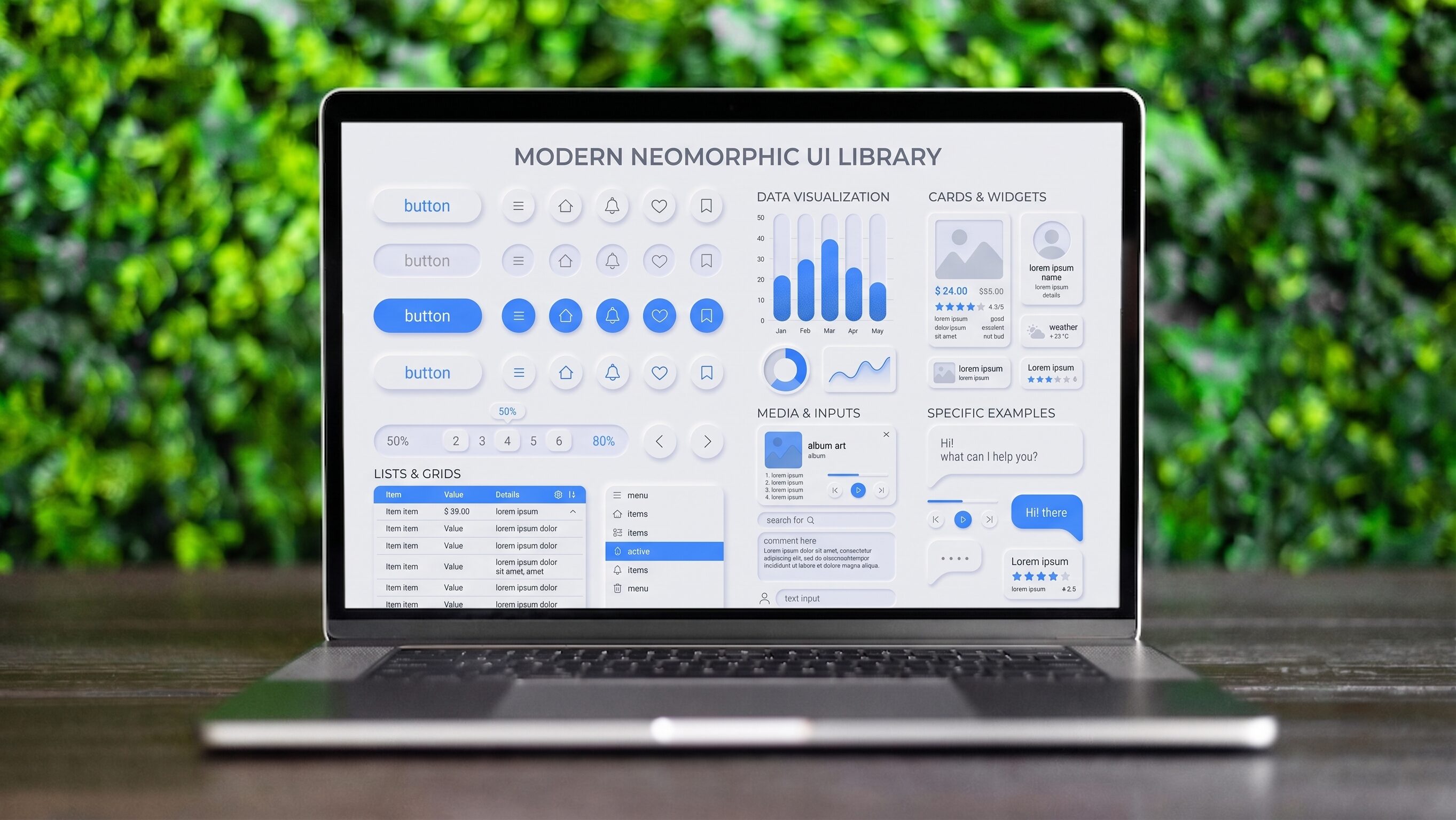
UI Design Tools News
Because design tools, layout paradigms, and AI workflows change monthly, staying informed is critical for remaining competitive in job interviews and your daily client work.
Bookmark these industry resources to track updates and tool announcements:
Designing for Multiple Devices: Cross-Platform Skills
A UI designer rarely creates an interface for just one screen or website. To build a competitive portfolio, you must demonstrate that you can adapt a single digital product across diverse viewport constraints without breaking the core user experience.
Understanding the unique requirements of each screen type changes how you execute your daily design tasks and build interactive prototypes:
Desktop & Web UI
The Precision Canvas
This refers to when you design for high-resolution monitors where users navigate with a precise mouse cursor. Giving you the spatial luxury to build multi-column layouts, deep drop-down mega menus, and hover-triggered micro-interactions for a website. You can include complex features and intricate animations.
Mobile UI
The Prioritization Challenge
You are forced to aggressively strip away visual noise due to limited screen real estate. Your main task is scaling down typography and shifting navigation elements out of the way. Building interactive prototypes helps test these tight spaces.
Touch Interfaces
The Tactile Shift
This applies directly to mobile, tablets, and kiosks where human fingers replace the precision of a mouse cursor. Your task shifts to engineering larger interaction areas, enforcing a strict minimum button size of 44×44 pixels, and designing for gestures like swiping, pinching, or dragging.
Portfolio Blueprint
Always display your core screens side-by-side across Desktop, Tablet, and Mobile, explicitly explaining how your layout adapts to each device when you create a project.
Modern Design Styles
Visual trends in design evolve rapidly. What was considered cutting-edge five years ago can quickly feel dated, untrustworthy, or simply clunky today. However, professional UI design is not just about chasing aesthetic fads, it is about balancing modern visual appeal with technical feasibility and accessibility in your design tool.
Understanding the shift from older, heavily textured interfaces to the clean, scalable aesthetics of today allows you to design products that feel native to the modern website. Below is a breakdown of the core visual styles dominating the industry.
UI Design Font
Typography dictates visual hierarchy, readability, and a product’s brand personality. Modern digital fonts prioritize high screen legibility by using larger x-heights and clean, geometric letterforms in every user interface. As a designer, you must master variable fonts, single files that allow you to infinitely adjust weight and width for fluid, responsive typography on a website.
Top Modern UI Fonts
- Inter: The industry standard for digital products, optimized for exceptional readability at tiny sizes.
- Satoshi: A clean, geometric sans-serif that brings a crisp, technical aesthetic to software dashboards and SaaS platforms.
- DM Sans: A low-contrast, highly scalable typeface designed to perform beautifully in constrained mobile environments.
Color Theory in UI Design
In digital interfaces, colors are functional communication tools, not just decorations. Red universally signals a destructive action, like deleting a file, while green indicates success. Modern designers must balance this visual communication with strict accessibility standards, ensuring contrast ratios between text and backgrounds are high enough to pass digital compliance checks on any website.
Modern Color Application:
- Expressive Blur Gradients: To break away from flat color blocks, contemporary interfaces frequently apply soft, blurred gradient backgrounds (often called “aurora” gradients) to inject brand personality without distracting from core content.
- Dark Mode Strategy: Modern UI leans dark-first. Instead of simply inverting white to pure black, designers use layered shades of deep gray to minimize eye strain and visually establish depth using their design tool.
Minimalist UI Design
Minimalism in design is the practice of stripping away unnecessary decorative elements, like heavy drop shadows, complex textures, and excessive borders, to focus entirely on content and functionality. Often referred to today as “calm interfaces”, this modern style drastically reduces cognitive load and speeds up product load times. However, designers must be careful not to push minimalism so far that it creates discoverability issues (where users cannot tell if text is a clickable button) or strips the digital product of its unique brand personality.
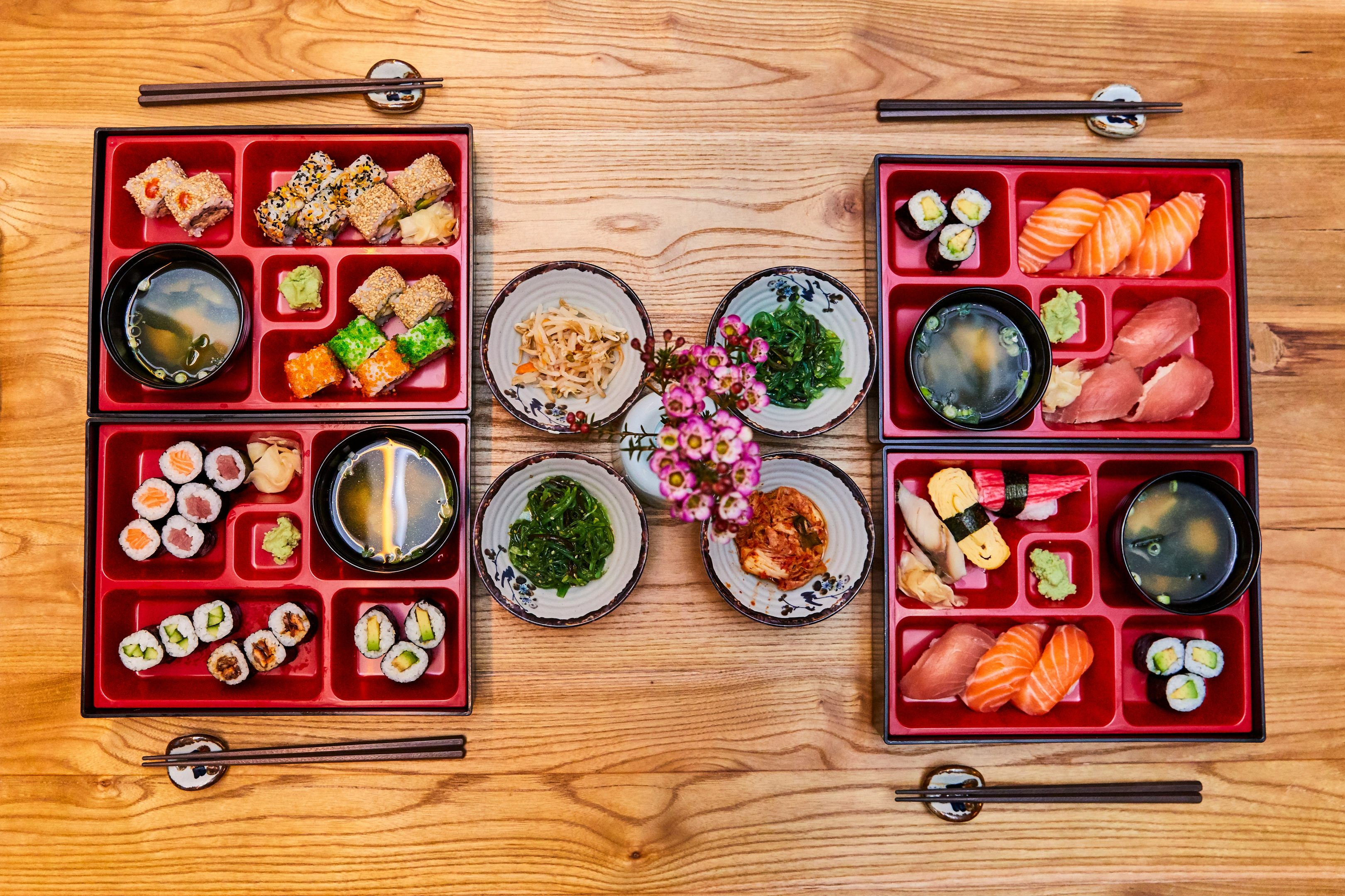
Bento Grid UI Design
A highly popular modern iteration of minimalism is the Bento Grid, where content is neatly organized into clean, rounded rectangular modules, resembling a Japanese bento box on a website. You can easily create this in any design tool.
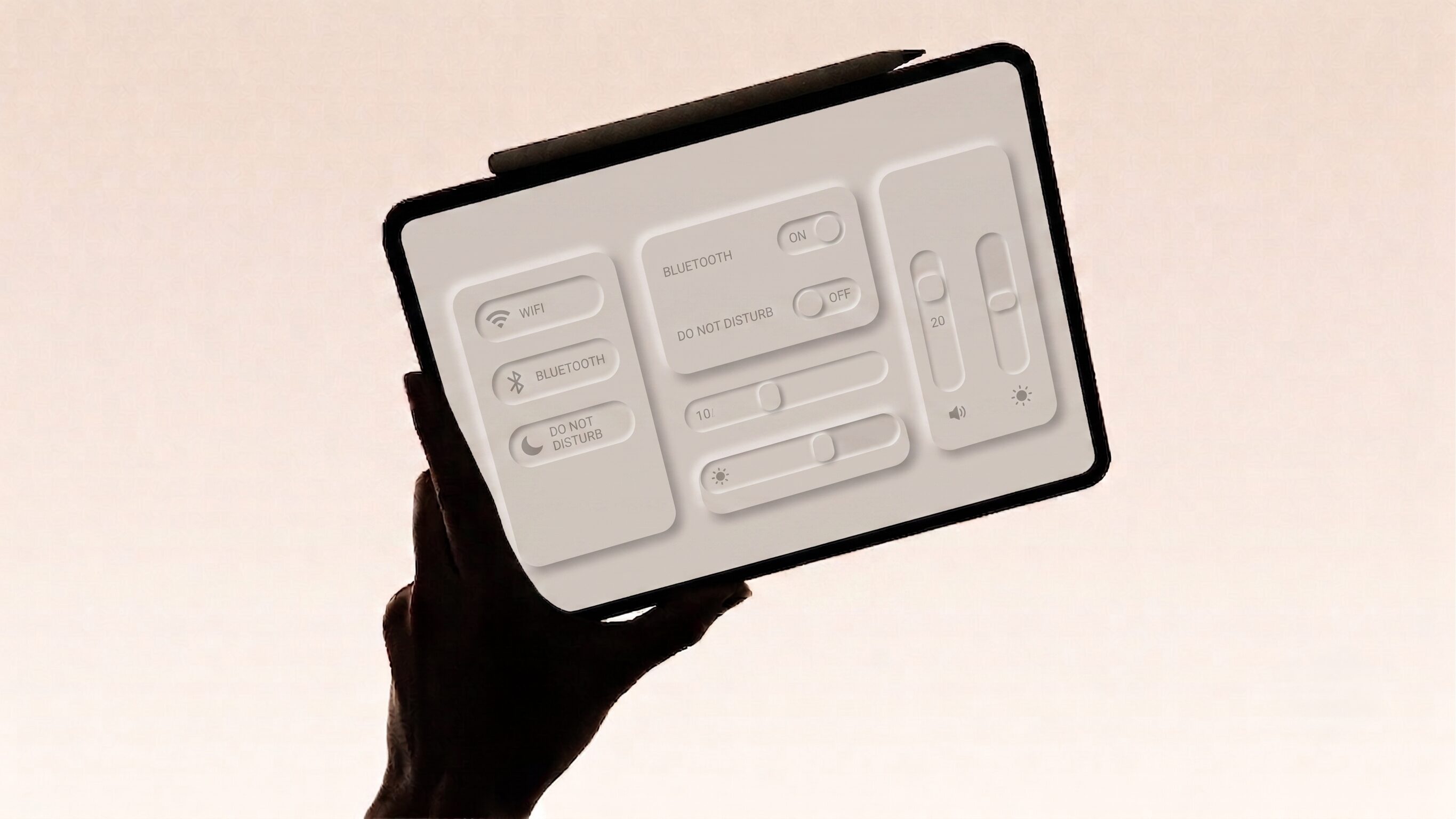
Neumorphism UI Design
A prime example of how extreme minimalism can loop back around to feel futuristic. This style (often called “soft UI”) mimics extruded, matte plastic by using subtle, dual-directional shadows, making elements appear as if they are physically pressed out from a single, continuous background. While highly tactile and visually striking, its inherently low contrast struggles to pass basic accessibility standards, meaning it remains popular in conceptual prototypes but is rarely deployed in functional, commercial sites.
Futuristic UI Design
The definition of “futuristic” in design is a moving target, fundamentally tethered to technological feasibility. For an aspiring designer, understanding this distinction is critical: what begins as a technically challenging, forward-thinking concept quickly morphs into a popular trend, before either becoming a standardized convention or fading away entirely.
True boundary-pushing design today requires immense technical execution and is often used by gaming, Web3, and cutting-edge tech platforms to signal extreme innovation. This looks like immersive 3D environments, organic kinetic typography (moving text), and Agentic AI interfaces that dynamically adapt their layouts based on predictive user behavior rather than fixed navigation paths.
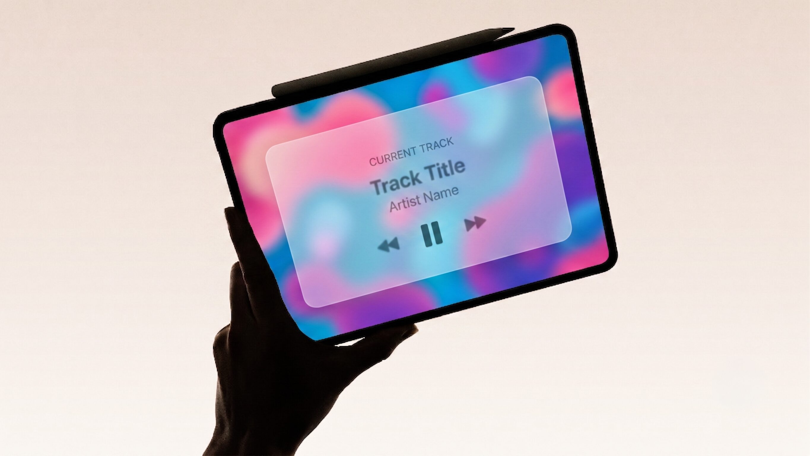
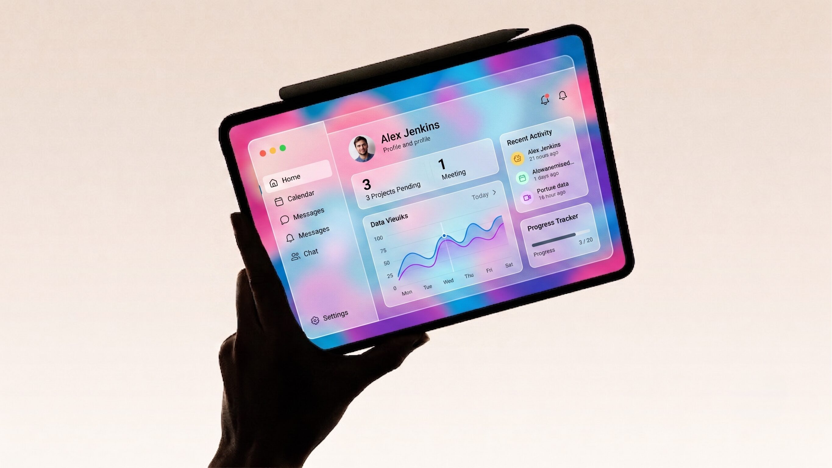
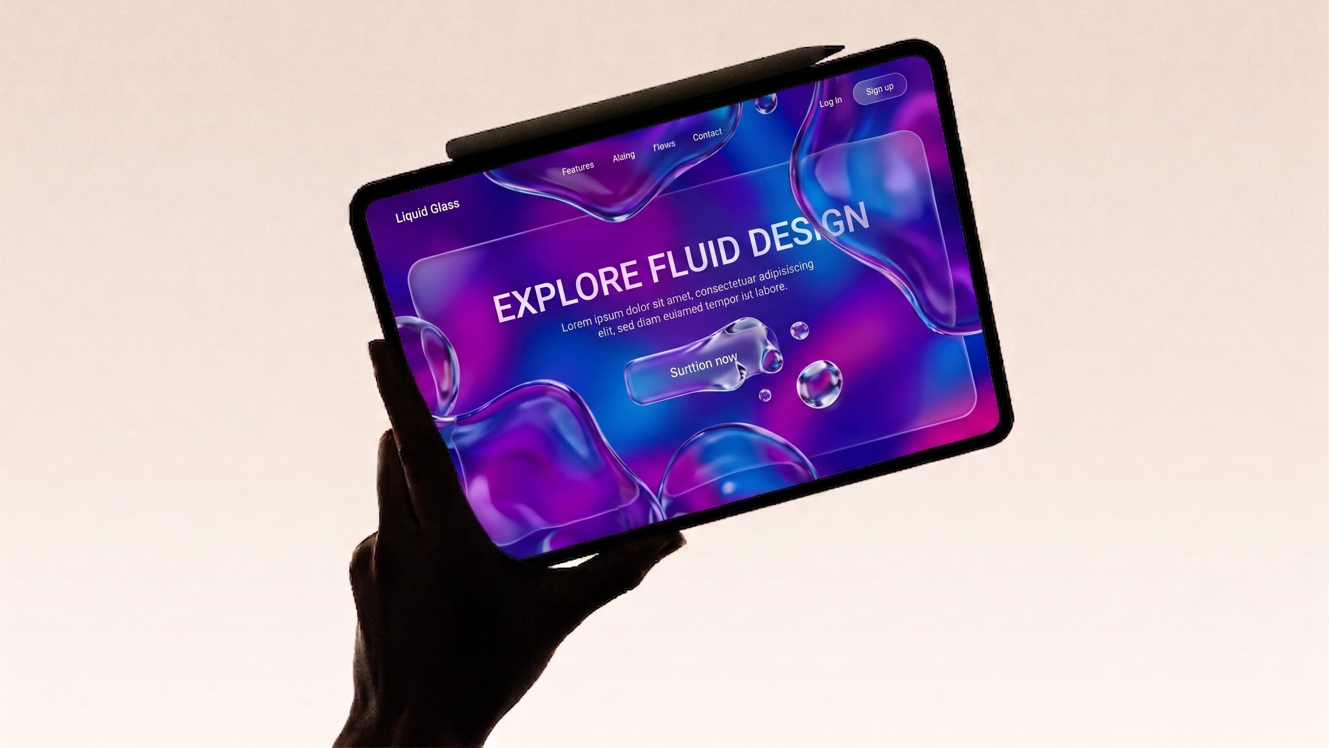
To understand where UI is going, it helps to examine visual languages that once seemed incredibly futuristic, tracing how they became the foundation for what is considered modern today. Below is an evolution of one of the most prominent futuristic visual concepts over the last few years: translucent and layered interfaces.
- 1
IterationGlass UI Design
An early concept mimicking frosted glass with blurred, semi-transparent backgrounds over colorful shapes. While beautiful, it suffered from severe text accessibility issues against unpredictable backdrops.

- 2
IterationGlassmorphism UI Design
The matured, usable version of glass interfaces. It pairs subtle translucent layers and noise textures with crisp, semi-transparent white borders. This creates a realistic sense of depth without sacrificing text readability.
- 3
IterationLiquid Glass UI Design
A high-end variant that introduces fluid motion and animations. These interfaces organically warp or ripple based on cursor movement or phone tilt. Because it requires immense processing power, it is currently reserved for marketing landing pages or website homepages rather than functional dashboards.
UI Design Patterns
When users open a new digital product or website, they rely on subconscious expectations built from every other app they have ever used, such as expecting a magnifying glass to initiate a search. A design pattern is a reusable, standardized solution to a recurring interface problem.
Instead of reinventing the wheel for every screen, mastering these proven blueprints allows you to build products that are instantly familiar, accessible, and intuitive. Hiring managers look closely at your portfolio to ensure you can deploy these standard layouts to solve real user frustrations rather than just designing for raw aesthetics.
To help you build this foundational knowledge, we will look at the most commonly used patterns found in UI design tools.
Navigation & Organization Patterns
Card UI Design
The Blueprint
A modular container that groups related information, such as an image, a headline, a short description, and a call-to-action, into a single, visually distinct rectangular box.
Best Used For
E-commerce product listings, blog article feeds, and dashboard overviews on websites where you need to display bite-sized entry points to deeper content.
Pro Tip
The entire card should be clickable, not just the text link or button inside it. This vastly improves the touch target size for mobile users.
Accordion UI Design
The Blueprint
A vertically stacked list of headers that users can click to expand or collapse, revealing or hiding the detailed content associated with that specific header.
Best Used For
FAQ sections, complex settings menus, and mobile navigation for a website where vertical screen real estate is limited and you want to reduce cognitive overload.
Pro Tip
Always use clear visual indicators, like a plus icon or a downward-facing chevron (v), to signal to the user that the section can be expanded.
Carousel UI Design
The Blueprint
A horizontally scrolling list of items (usually images or cards) that allows users to swipe or click through a gallery within a single, contained section of the page.
Best Used For
Highlighting featured promotions, image galleries, or top-rated products on a website without forcing the user to scroll endlessly down the page.
Pro Tip
Carousels often suffer from low engagement because users don’t realize there is more content. Always include partial visibility (letting the next card peek into the edge of the screen) to encourage horizontal scrolling.
Discovery & Input Patterns
Effective Search User Interface
The Blueprint
The comprehensive visual system that allows a user to query a database and find specific information. This encompasses both the initial search bar UI design (the input field and submit button) and the subsequent search results UI design (how the queried data is structured and presented).
Best Used For
Content-heavy platforms, e-commerce stores, and complex data dashboards on a website where manual navigation would take too long.
Pro Tip
Auto-suggestions are mandatory for a modern search bar. As the user types, providing a dropdown of predicted queries drastically reduces user error and speeds up the discovery process.
Filter UI Design
The Blueprint
A set of interactive controls (checkboxes, sliders, dropdowns) that allows users to narrow down a large dataset by excluding items that do not match their specific criteria.
Best Used For
E-commerce catalogs (filtering by size, color, price) and real estate or travel booking platforms. Most UI design tools offer pre-built filtering features.
Pro Tip
Always show the user exactly how many items they have filtered. Including a dynamic number on the “Apply” button (e.g., “Show 34 Results”) prevents the user from accidentally filtering down to zero results.
Form UI Design
The Blueprint
A structured set of input fields, radio buttons, and text areas designed to collect specific data from the user, culminating in a submit action.
Best Used For
User registration, checkout flows, contact pages, and survey collections on a website.
Pro Tip
Never rely solely on placeholder text inside the input box to label the field. When the user starts typing, the placeholder disappears, which can cause them to forget what the field was for. To avoid confusion, always use persistent top-aligned labels.
System Design Patterns
Modal UI Design
The Blueprint
A dialogue box or pop-up window that appears on top of the main screen, temporarily disabling the background content (often by dimming it) to force the user to interact with the new window.
Best Used For
Critical confirmations (e.g., “Are you sure you want to delete this file?”), brief data entry, or forcing the user to acknowledge an important system error.
Pro Tip
Modals are highly disruptive to the user experience. Use them sparingly, and always provide a highly visible “X” icon or a “Cancel” button so the user can easily escape. To test their effectiveness, develop them as prototypes in your chosen design tool.
Dark Mode UI Design Patterns
The Blueprint
An alternative color theme where the default light background is swapped for dark grays or blacks, and the text is inverted to light colors, reducing light emission from the screen. Modern UI design tools can toggle this easily.
Best Used For
Applications that users frequently interact with at night, reading-heavy platforms, or apps aiming for a premium, cinematic aesthetic.
Pro Tip
Never use pure black (#000000) for your backgrounds or pure white (#FFFFFF) for your text. The contrast is actually too harsh and causes eye strain. Use deep, desaturated grays for backgrounds and soft off-whites for text. Many free templates account for this.
UI Design Tips
To conclude your deep dive into the tools and skills of UI/UX design, here are three rapid-fire tips to accelerate your growth:
- Recreate to Innovate (Copywork): The fastest way to build software muscle memory and understand spacing is to take screenshots of your favorite apps or a beautifully designed website and recreate them in Figma or your preferred design tool.
- Never Use “Lorem Ipsum”: Always design with real, messy data. Using perfectly uniform dummy text makes your designs look great in a portfolio but fail in the real world when user names are unexpectedly long or data fields are missing. Mock up real scenarios in your prototypes.
- Check on the Actual Device: A mobile design might look perfectly legible on your 27-inch monitor, but it will feel completely different on a physical phone. Always use mirroring apps (like Figma Mirror) to test your touch targets and typography scaling in your own hand. If you are using a free tool, check if it supports mirroring.
FAQ
get started
Accelerate Your Design Career
Courses built on adaptive curriculum and led by leading industry experts.
Work on projects in a collaborative setting
Get access to VIP events and workshops
Taught by industry experts